
California
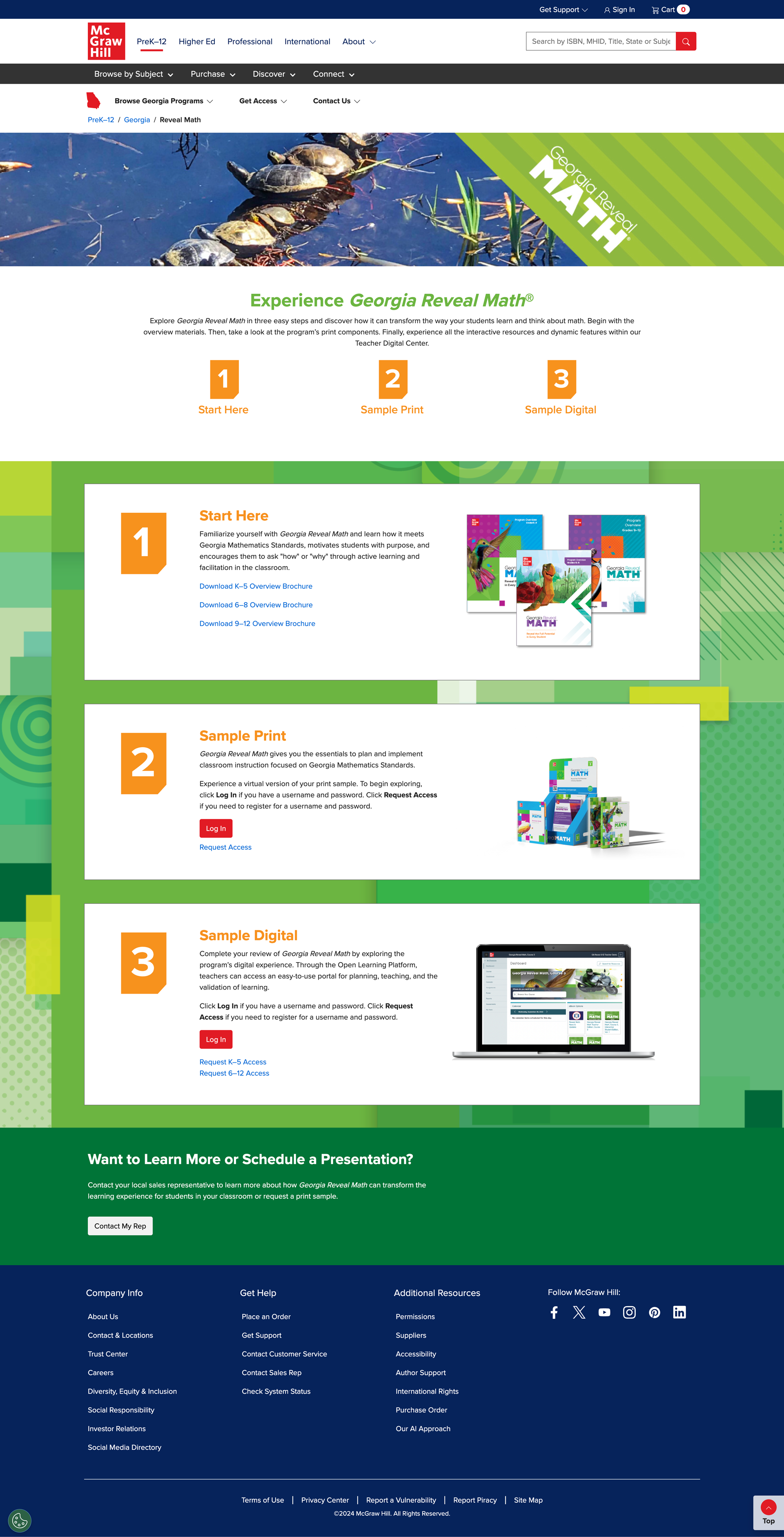
Reveal Math
Many states around the country follow an adoption cycle for education curriculum. This is where a state-appointed board sends out a bid for new subject programs and reviews submissions from Edtech companies to see if their programs meet the state specific standards. California has a bid out for new Math Curriculum, so McGraw Hill created a California version of their national program to meet the states criteria. Our job was to build out a site that supports our sales team in the field with pertinent information for reviews and to guide them towards sampling.
Role: Lead Designer
Skills: UX, Visual Design
Tools: Figma, Lucidchart, Photoshop, Illustrator
Collaborators: Orly Lipset, Sr. Copywriter

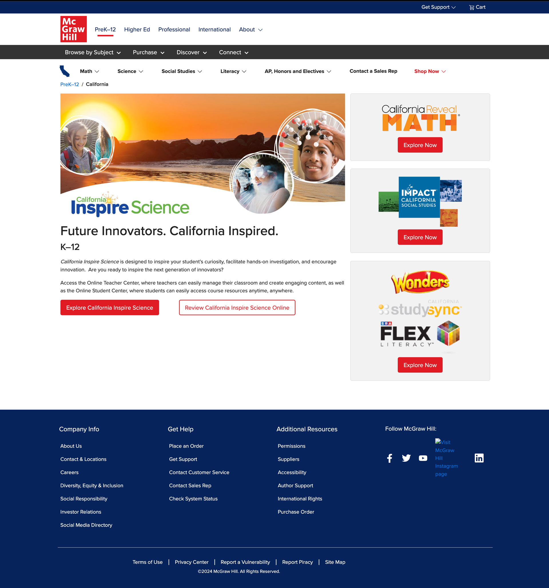
Former California Home
Goals
Marketing partner goals: Through two phases, design a new web experience for the California state page as well as creating a new California Reveal Math site.
Customer focused goals: Help educators and reviewers to readily review our program to aid in their review process.
Process
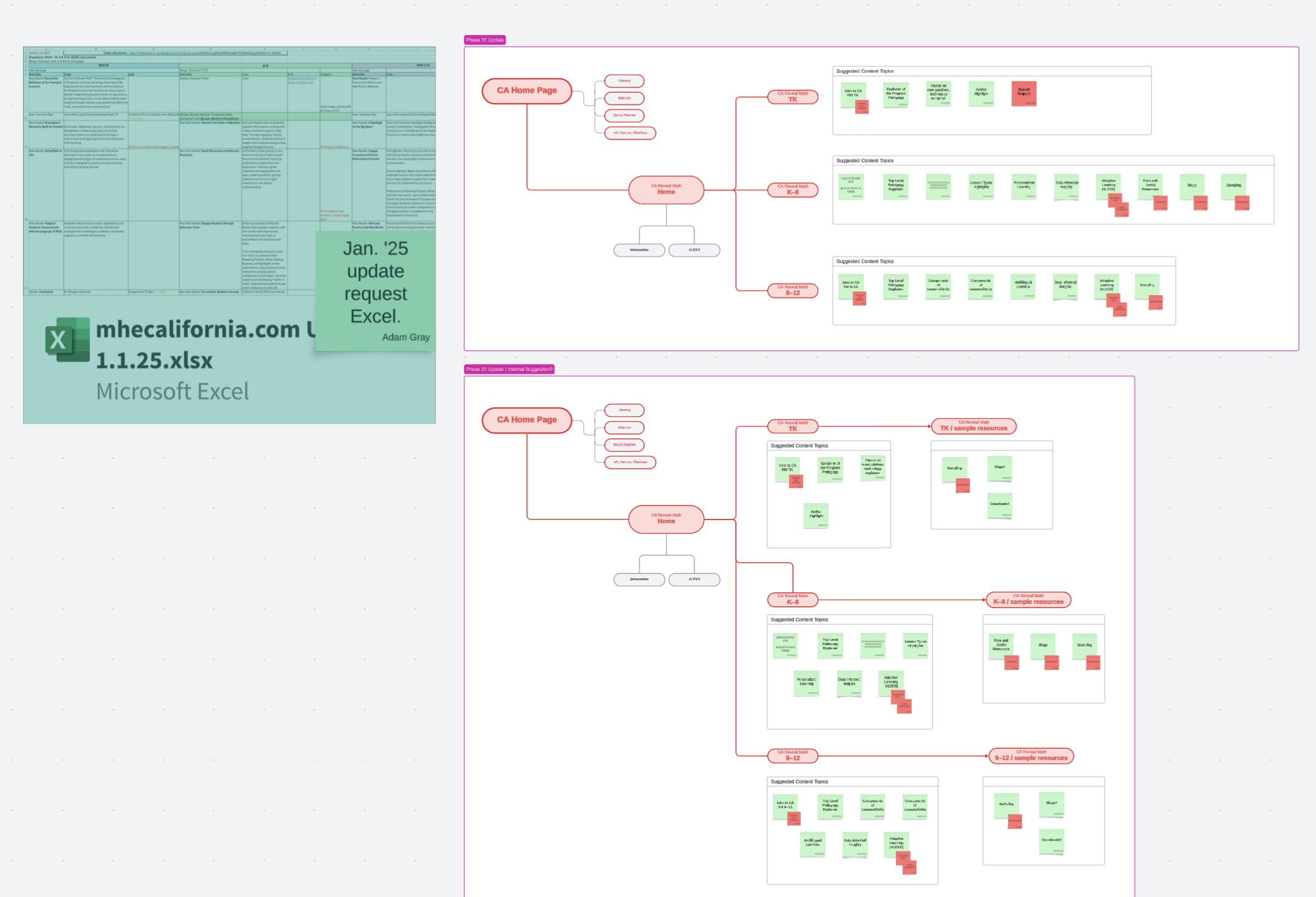
We needed to build out our site in phases over time because it was in active development, so I had to collaborate closely with our California Marketing Manager to better understand what information was important early on and further down the line. We started by first plotting out what content was available for Phase 1 and what wouldn’t be ready until Phase 2 in January ‘25.
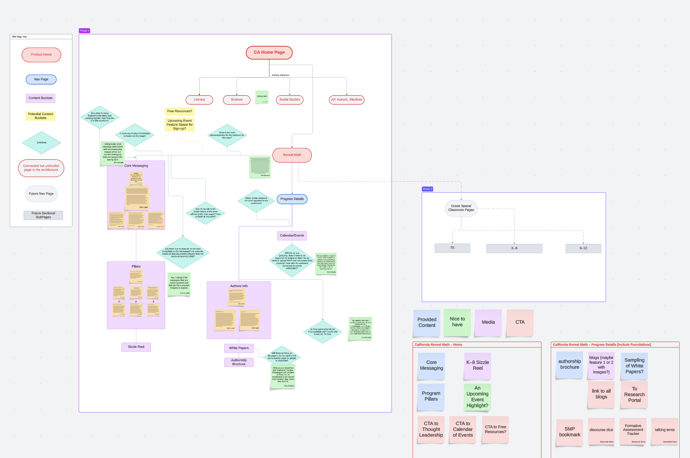
Phase 1 was meant to be a program teaser page that highlighted the pillars and the authors of the program and supported early integrated marketing campaigns.
Phase 2 was to provide a more robust Program Story and deeper exploration in the the Grade Spans, as well as access to Sampling.
Phase 1
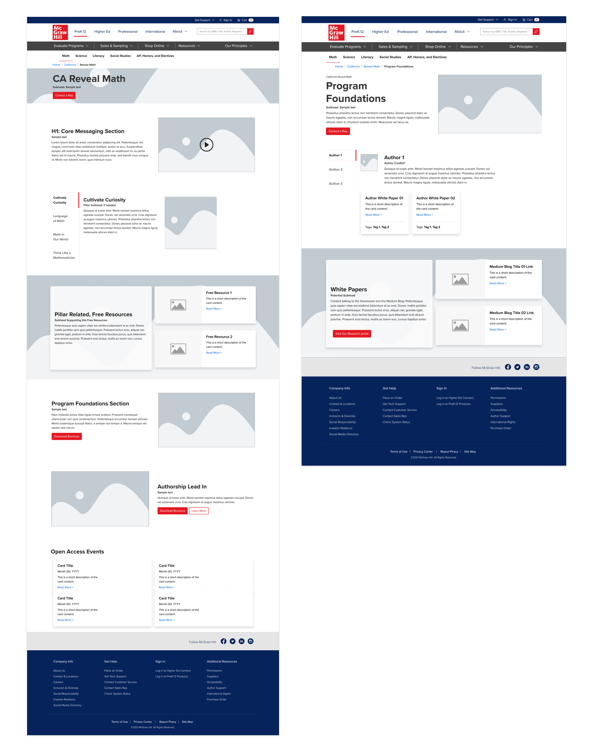
California State Site Wireframe
With this request, we also needed to update the California State Home page. In the years since the California site was initially created by another team, we had developed a more templated structure for our state sites. This was in an effort to align them closer to McGraw Hill Branding but also to speed up the build time for the varying state adoptions requests that come our way.
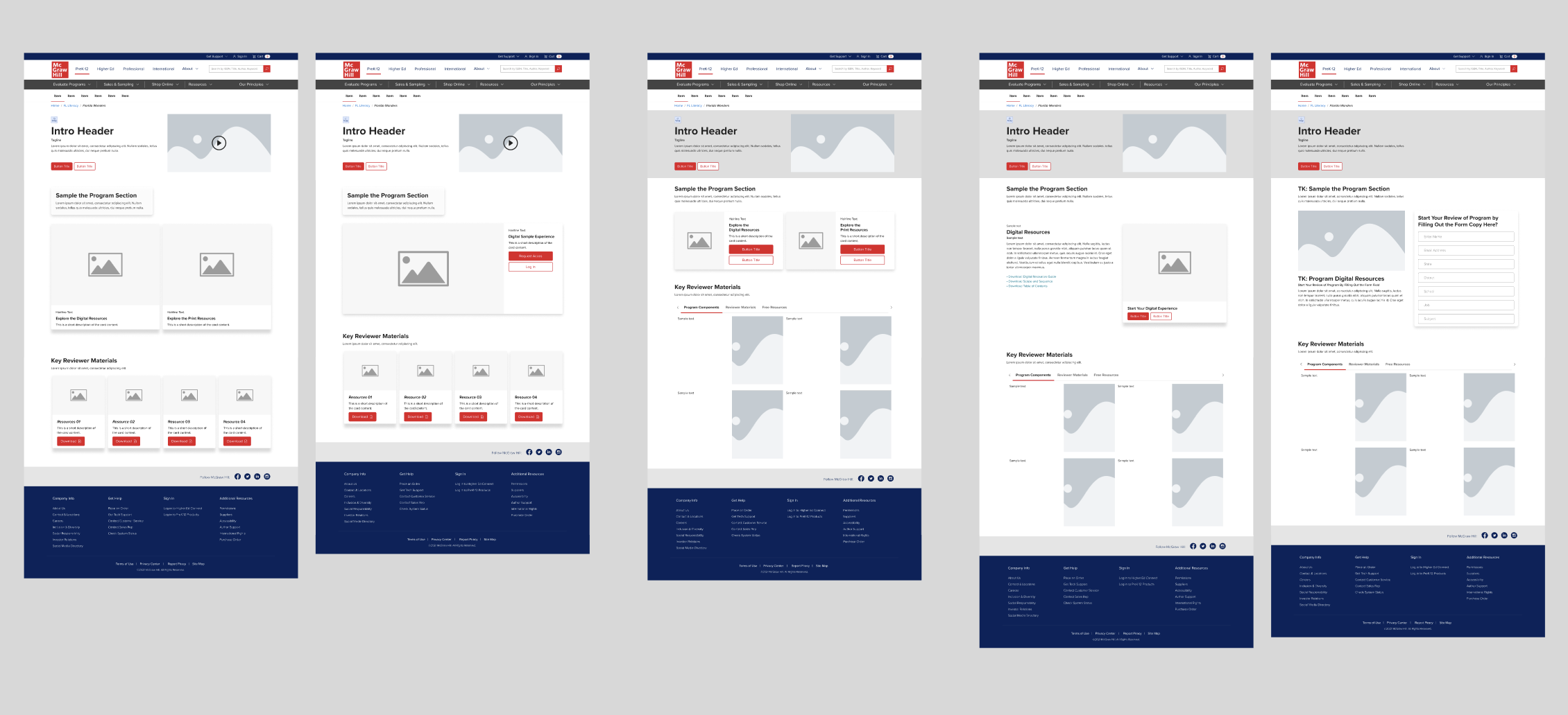
Sample Resources Concept Exploration
With eyes on the Phase 2, I wanted to use this time to explore a new format for our Sample Pages. In the past, we’ve done a “1,2,3” structure that presented marketing collateral downloads first then access to Digital and Print Sampling.
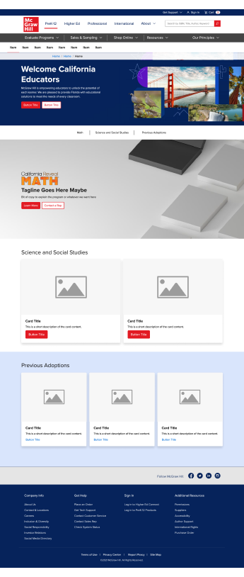
Example123 Page
These 1,2,3 pages served a function, but overtime they developed into the catch-all destination for our marketing partners Print Collateral. So, customers would interact with a QR Code, Vanity URL with the expectation to “Sample” but would be first hit with downloads of material they likely already have access to.
California Reveal Math Wireframe
With this request, we also needed to update the California State Home page. In the years since the California site was initially created by another team, we had developed a more templated structure for our state sites. This was in an effort to align them closer to McGraw Hill Branding but also to speed up the build time for the varying state adoptions requests that come our way.
Sample Resource Re-Structure
Research informed us that many of our customers would skip Step 1 entirely, so our marketing partners would then adjust their CTA’s to anchor link straight to Step 2. I also wanted to update the flow so that it aligned closer to the CTA’s that offer “Sampling”. So, I explored some new options with different focuses.

Design
With the program still being completed as we built out Phase 1, I knew the design would have to be a bit stripped back so it didn’t feel to disconnected from product when it was finished.